This is a multi-part article
You're reading part 3.
So far, we worked on the Hello World Android App generated by Android Studio.
However, the point of all this is to create the TODO LINK MVP of an Android App for LMS, and find out how easy/hard it is.
The requirements are:
- an input field to search, initially empty
- a list displaying persons (id, first name, and last name)
- the same behaviors as the PyLMS UI: display all persons by default, display the result of filtering first and last name by the value of the input field on submit
- (Optional) use state-of-the-art/recommended UI patterns for Android
Kotlin for programming
I knew from keeping an eye on the news that Kotlin is THE programing language for Android for a while.
I never programmed with Kotlin. I do have a high-level understanding of the language from looking at Java-Kotlin comparison articles over time and collaborating with Kotlin developers at work.
I'm happy to have a practical opportunity to learn a new language. Plus, I'm super eager to find out how a language intended to provide a faster and more fluent syntax for coding on the JVM compares to Python.
Jetpack Compose for the UI
I recalled from past looks at Android programming that the UI was coded with XML. And indeed, the 1st few resources I found confirmed it.
Yet, my deep self couldn't help but try and find an alternative where I could code everything (eg. generate XML with Code).
And indeed, after a little googling, I stumbled upon articles talking about Jetpack Compose as the new and recommended way of UI programming for Android, and I liked what I saw.
In a nutshell, Jetpack Compose has nothing to do with XML and my understanding of it is:
- it is based on Kotlin functions, annotated with
@Composable, each describing a piece of the UI - functions are composed of one another, down to using Jetpack Compose base UI
@Composablefunctions (eg. an input field) (or drawing functions -- I guess), - and variables implementing
State(or more commonlyMutableState), to hold any state related to the UI.
Jetpack Compose is then responsible for drawing the UI calling these methods, as well as refreshing the UI, upon both user/system events and changes of state variables (which Jetpack monitors), calling only the impacted functions.
As a consequence, it's important to understand that @Composable functions:
- may not be called in the order they are defined in code,
- will be called multiple times,
- can be called in parallel,
- as a consequence, they must not have side effects.
Note
@Composable functions are expected to be named with a capital head letter. This is not standard for Kotlin.
Since functions are typically named after components, my guess is that it is intended to make it easier for developers to reason around functions as composable UI components.
Recommended Android app UI
I'm not a UI guy. So, my go-to action is to find references on how to design an Android app.
Turns out, there is exactly that, provided directly by Google: Material Design 3.
Scaffold is a top component, provided by Jetpack Compose, that provides scaffolding to create an App with the
typical (and recommended) appearance: a top bar, a bottom bar, content in the middle, and a floating action
button.
I took the code sample from Android Developer and built my MVP from there:
- ➊ usage of the
TopAppBarfunction requires addingOptIn(ExperimentalMaterial3Api::class)to the wrapping@Composablefunction - ➋ color code copy/pasted from code example
- ➌ top bar only need to contain the name of the App for now
- ➍ bottom bar will display infos about displayed data, whether it's filtered or not
- ➎ I disabled/hide the floating button as it is out of scope of the MVP, but it seems a great way to add a new person
- ➏ this function defines the "content" (what's between top and bottom bars) and takes a parameter
innerPaddingwhich must be passed to the top inner component. If not passed, inner content will render behind the top bar (if top aligned). - ➐ more on
PersonsListbelow (see List of persons) - ➑ passing the padding value as a
Modifiertype toPersonsList
@OptIn(ExperimentalMaterial3Api::class) # ➊
@Composable
fun AndroLMSScaffold() {
    Scaffold(topBar = {
        TopAppBar(colors = TopAppBarDefaults.topAppBarColors( # ➋
            containerColor = MaterialTheme.colorScheme.primaryContainer,
            titleContentColor = MaterialTheme.colorScheme.primary
        ), title = {
            Text("AndroLMS") # ➌
        })
    }, bottomBar = {
        BottomAppBar(
            containerColor = MaterialTheme.colorScheme.primaryContainer,
            contentColor = MaterialTheme.colorScheme.primary,
        ) {
            Text(
                modifier = Modifier.fillMaxWidth(),
                textAlign = TextAlign.Center,
                text = "Displaying everything",
            )
        }
//    }, floatingActionButton = { # ➎
//        FloatingActionButton(onClick = { }) {
//            Icon(Icons.Default.Add, contentDescription = "Create person")
//        }
    }) { innerPadding -> # ➏
        PersonsList( # ➐
            modifier = Modifier.padding(innerPadding) # ➑
        )
    }
}
Tip
Compose appears to make extensive use of the Kotlin convention that allows writing a lambda expression
after the function's arguments when the trailing parameter is a function (see ➏).
I find this quite neat, and it does improve the readability of the code.
At first sight, though, it does create confusion of capitalized functions with call to class constructors.
Note
Usage of @OptIn(ExperimentalMaterial3Api::class) may not be required in 35 and above, it is with API 34 (the one I target for my phone).
Sources
List of persons
To display a list of persons, I looked for a List, or tree component.
I didn't find one and quick googling (and asking Copilot on Skype - I had to use the software for communication,
discover it had a bot built-in and gave it a try) taught me that the correct approach with Android is to use a Column
component with any other repeated component inside. A Text one will do.
- 🄌 introducing a data class to mock a
Personin the app - ➊ following Compose approach, every piece of the UI is a
@Composablefunction - ➋ to be side-effect-free, it must take the list of persons to display as a parameter
- ➌ and accept the padding from
Scaffoldto not be displayed behind the top bar - ➍ using
LazyColumninstead ofColumnto get a vertical scrollbar - ➎ using the
itemsfunction from theLazyDslto load all the persons at once (which is not lazy at all, but KISS) - ➏ each person is represented on screen with a
PersonView, another@Composablefunction - ➐ a
PersonViewis only made of oneText, which content is the person's id followed by first and last name - ➑ the
Texttakes the full width of the screen (and content is left-aligned by default -- is it localized?)
data class Person(val id: Int, val firstname: String, val lastname: String?) # 🄌

@Composable
fun PersonsList( # ➊
    persons: List<Person>, # ➋
    modifier: Modifier # ➌
) {
    LazyColumn(modifier = modifier) { # ➍
        items(persons) { # ➎
            item: Person -> PersonView(item) # ➏
        }
    }
}

@Composable
fun PersonView(person: Person) { # ➏
    val lastname = if (person.lastname != null) " " + person.lastname else ""
    Text( # ➐
        text = "(${person.id}) ${person.firstname}${lastname}",
        modifier = Modifier.fillMaxWidth() # ➑
    )
}
To provide a list of persons to PersonsList, the calling code must be changed a bit:
- ➊ create a mocked list of 300 persons, odd ones don't have a last name
- ➋ we will change the list of persons and let's take the good habit of passing any data to the UI as
State.
This is not required though, passingpwill equally work for static content as it is now. - ➌ skipping unchanged constructor parameters in this snippet
- ➍ pass the persons
@OptIn(ExperimentalMaterial3Api::class)
@Composable
fun AndroLMSScaffold() {
    val p = (1..300).map { Person(it, "fn${it}", if (it % 2 == 0) "ln${it}" else null) } # ➊
    var persons by remember { mutableStateOf(p) } # ➋

    Scaffold(
        [...] # ➌
    ) { innerPadding ->
        PersonsList(
            persons = persons, # ➍
            modifier = Modifier.padding(innerPadding)
        )
    }
}
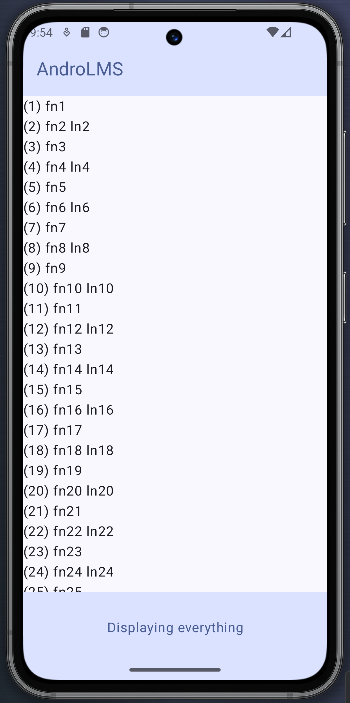
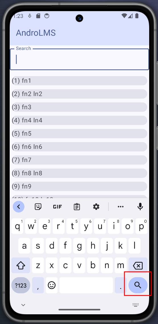
The result looks quite plain, but data is displayed and scrolling works:
Sources
Improve PersonView
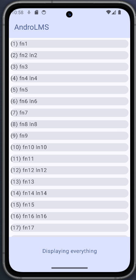
The least improvement to make is to have a clearer separation of the people lines and plan for future touch actions on them, highlighting the sensitive zone of each line.
- ➊ the
Cardfunction adds a background with rounded corners out of the box - ➋ adds a little distance between cards
- ➌ just add previous
Textas content for now.Cardis a container and would make it easy to add an icon, multiple texts with diverse alignments, ...
@Composable
fun PersonView(person: Person) {
    Card(modifier = Modifier.padding(5.dp)) { # ➊ ➋
        val lastname = if (person.lastname != null) " " + person.lastname else ""
        Text( # ➌
            text = "(${person.id}) ${person.firstname}${lastname}",
            modifier = Modifier.fillMaxWidth()
        )
    }
}
Search field
Add a TextField
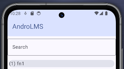
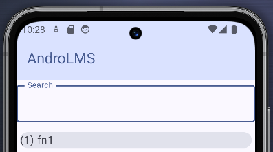
To allow searching a person, I'll add an input field between the top bar and the list of persons.
- ➊ using a
Columnto put the search field "on top" of the list of persons, withing the content of theScaffoldcomponent. Note that theColumnreceives the modifier fromScaffoldnot theLazyColumnanymore. - ➋ using a
Composablefunction for the search field is overkill at this stage since it contains a single component but this will become useful as the component becomes more complex - ➌ add a
10"dp" (for Density Independent Pixel, aka. dpi) between the search field and the list - ➍ Using an
OutlinedTextField, only the style changes and I believe it looks much better at very low cost - ➎ parameters
valueandonValueChangeare discussed below (TODO link). They are mandatory, so provide empty values - ➏ use "Search" as label. it is plain text but could easily include an icon or whatever. Out of the box, the label neatly appears within the text field until the user focuses on it, and it moves to the top-left and over the outline.
- ➐ limit the field to display only one line. At this stage, user can use return to create more than one line, and they won't be visible.
@Composable
fun PersonsList(persons: List<Person>, onSearchStringChange: (String) -> Unit, modifier: Modifier) {
    Column(modifier = modifier) {
        SearchField(onSearchStringChange)
        LazyColumn(modifier = Modifier.padding(start = 0.dp, end = 0.dp, top = 10.dp, bottom = 0.dp)) {
            items(persons) { item: Person -> PersonView(item) }
        }
    }
}

@Composable
fun SearchField() { # ➋
    OutlinedTextField( # ➍
        value = "", # ➎
        onValueChange = {}, # ➎
        label = { Text("Search") }, # ➏
        modifier = Modifier.fillMaxWidth(),
        singleLine = true, # ➐
    )
}
Sources
React upon line return
In its current form, the TextField displays only one line but accepts line returns to create more than one.
I'd rather have search triggered when the user hits enter/line return and use the content of the TextField to filter the list.
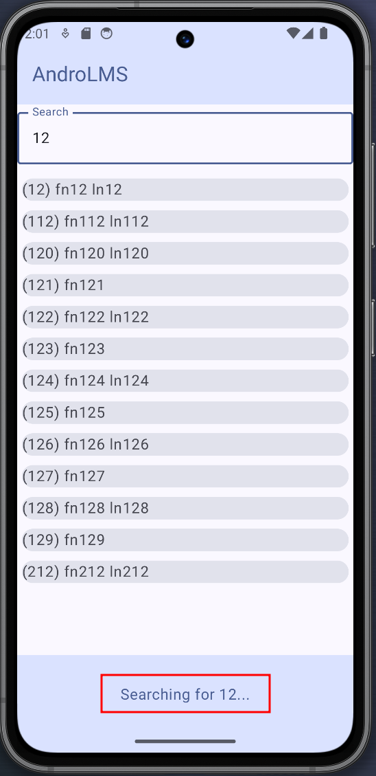
As a first step, I'll display the filtering string in the bottom bar.
This can be achieved with TextField built-in keyboardOptions :
- ➊ define a state
stringvariable namedsearchQueryto hold the value of the search - ➋
topBaris unchanged - ➌ the
bottomBarwill display "Displaying everything" unlesssearchQueryhas content. It will be automatically updated whensearchQueryis updated - ➍ pass a function to
PersonsList(see below) that takes some text and set it as value ofsearchQuery - ➎
PersonsListnow accepts a function and pass it as is toSearchField - ➏
SearchFieldnow accepts a function argument. This function takes a singlestringargument and returning nothing - ➐ define a state
stringvariable namedlocalTextto hold the content of the textfield. Using parameteronValueChangeand a lambda, this variable is updated with every change of theTextFieldcontent. - ➑ when
imeActionisImeAction.Search, an amplifying glass is displayed on the keyboard. No new line can be added to theTextField, instead a keyboard action called 'search' is triggered. - ➒ define a
keyboardActionswhen 'search' is triggered, functiononSearchStringChangeis called with the current value oflocalText.
@OptIn(ExperimentalMaterial3Api::class)
@Composable
fun AndroLMSScaffold() {
    val p = (1..300).map { Person(it, "fn${it}", if (it % 2 == 0) "ln${it}" else null) }
    var searchQuery by remember { mutableStateOf("") } # ➊
    var persons by remember { mutableStateOf(p) }

    Scaffold(topBar = {
        [...] # ➋
    }, bottomBar = {
        BottomAppBar(
            containerColor = MaterialTheme.colorScheme.primaryContainer,
            contentColor = MaterialTheme.colorScheme.primary,
        ) {
            Text(
                modifier = Modifier.fillMaxWidth(),
                textAlign = TextAlign.Center,
                text = if (searchQuery.isNotEmpty()) "Searching for ${searchQuery}..." else "Displaying everything", # ➌
            )
        }
    }) { innerPadding ->
        PersonsList(
            persons = persons,
            onSearchStringChange = { text: String -> # ➍
                searchQuery = text
            },
            modifier = Modifier.padding(innerPadding)
        )
    }
}

@Composable
fun PersonsList(persons: List<Person>,
                onSearchStringChange: (String) -> Unit, # ➎
                modifier: Modifier) {
    Column(modifier = modifier) {
        SearchField(onSearchStringChange) # ➎
        LazyColumn(modifier = Modifier.padding(start = 0.dp, end = 0.dp, top = 10.dp, bottom = 0.dp)) {
            items(persons) { item: Person -> PersonView(item) }
        }
    }
}

@Composable
fun SearchField(onSearchStringChange: (String) -> Unit) { # ➏
    var localText by remember { mutableStateOf("") } # ➐

    OutlinedTextField(
        value = localText, # ➐
        onValueChange = { localText = it }, # ➐
        label = { Text("Search") },
        modifier = Modifier.fillMaxWidth(),
        singleLine = true,
        keyboardOptions = KeyboardOptions(imeAction = ImeAction.Search), # ➑
        keyboardActions = KeyboardActions(onSearch = { # ➒
            onSearchStringChange(localText)
        }),
    )
}
Sources
- In a question on how to hide the keyboard (see below), a user demonstrates how to use
ImeAction.search- Stackoverflow - Best practices with TextField state - Android Developer
- Effective State Management for TextFields - Medium
Hide keyboard upon line return
The keyboard taking a big share of the screen, I was immediately frustrated not seing the whole list once I hit search.
To hide the keyboard upon hitting search:
- ➊ trigger the ImeAction
Doneto hide the keyboard and presumably release focus.TextFieldkeeps it in this case, though. I assume because no other component can take it.
@Composable
fun SearchField(onSearchStringChange: (String) -> Unit) {
    var localText by remember { mutableStateOf("") }

    OutlinedTextField(
        value = localText,
        onValueChange = { localText = it },
        label = { Text("Search") },
        modifier = Modifier.fillMaxWidth(),
        singleLine = true,
        keyboardOptions = KeyboardOptions(imeAction = ImeAction.Search),
        keyboardActions = KeyboardActions(onSearch = {
            onSearchStringChange(localText)
            this.defaultKeyboardAction(ImeAction.Done) # ➊
        }),
    )
}
Behavior upon triggering the keyboard action is not specifically defined, and could be platform dependant/change over time.
An alternative is to use LocalSoftwareKeyboardController, which is specific to the behavior we are looking for, and will
come in handy when we can't access the KeyboardActionScope (the type exposing function defaultKeyboardAction):
- ➊ get the current
LocalSoftwareKeyboardController - ➋ call the
hidefunction. Usage of?.operator appears to be required.
@Composable
fun SearchField(onSearchStringChange: (String) -> Unit) {
    var localText by remember { mutableStateOf("") }
    val keyboardController = LocalSoftwareKeyboardController.current # ➊

    OutlinedTextField(
        value = localText,
        onValueChange = { localText = it },
        label = { Text("Search") },
        modifier = Modifier.fillMaxWidth(),
        singleLine = true,
        keyboardOptions = KeyboardOptions(imeAction = ImeAction.Search),
        keyboardActions = KeyboardActions(onSearch = {
            onSearchStringChange(localText)
            keyboardController?.hide() # ➋
        }),
    )
}
Sources
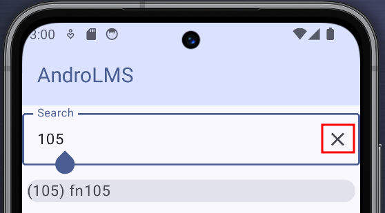
Add icon to clear search
Out of curiosity rather than out of necessity, I wanted to find out how I could implement a clear button on the search field.
TextField defines a trailing icon out of the box. It's only a matter of adding some behavior to it and find a way to
display it only when the TextField is not empty:
- ➊ other parameters unchanged
- ➋
ifcould be used and be a little shorter, but I like how usingwhenmakes the code more descriptive - ➌ use
localText.isNotEmpty()to display the icon only when the TextField has some content - ➍ use system's icon for 'Clear'
- ➎ hide the keyboard
- ➏ clear the
TextField - ➐ update the bottom bar
@Composable
fun SearchField(onSearchStringChange: (String) -> Unit) {
    var localText by remember { mutableStateOf("") }
    val keyboardController = LocalSoftwareKeyboardController.current

    OutlinedTextField(
        [...], # ➊
        trailingIcon = {
            when { # ➋
                localText.isNotEmpty() -> Icon(  # ➌
                    Icons.Default.Clear, # ➍
                    contentDescription = "clear search",
                    modifier = Modifier.clickable {
                        keyboardController?.hide() # ➎
                        localText = "" # ➏
                        onSearchStringChange("") # ➐
                    }
                )
            }
        }
    )
}
Sources
Filter the list of persons
Finally, it's time to filter the content of the list:
- ➊ move variable
pwith dummy content to a function implementing filtering with (really) dummy code - ➋ assign variable
personwith list of persons filtered by with an empty search string - ➌ when search string is modified, assign variable
personwith the filtered list of persons
private fun searchPersons(text: String): List<Person> { # ➊
    val p = (1..300).map { Person(it, "fn${it}", if (it % 2 == 0) "ln${it}" else null) }
    return p.filter { it.firstname.contains(text) }
}

@OptIn(ExperimentalMaterial3Api::class)
@Composable
fun AndroLMSScaffold() {
    var persons by remember { mutableStateOf(searchPersons("")) } # ➋
    var searchQuery by remember { mutableStateOf("") }

    Scaffold(
        [...]
    }) { innerPadding ->
        PersonsList(
            persons = persons,
            onSearchStringChange = { text: String ->
                searchQuery = text
                persons = searchPersons(text) # ➌
            },
            modifier = Modifier.padding(innerPadding)
        )
    }
}